Monday, April 21, 2014

I Want That: Gold Gluckstein Trays

image

When serving buffet-style or setting up a bar area on the kitchen island, I like to keep glasses and beverages grouped in trays for easy access and less clutter. I have been searching for large gold or brass trays to use, but haven’t found anything big enough, so I was very excited to see the Sydney large square tray at The Bay the other day. Designed by Brian Gluckstein, the trays have a sleek profile in a matte brass finish and at $35, won’t totally break the bank either.

GLUCKSTEINhome Sydney Square Trays, $25-35

Friday, April 18, 2014

Egg-cellent Easter Decor

There are so many different directions you can go with Easter decorations, but I’ve always been drawn to the classic spring colours and sweet small scale patterns that remain tried and true year after year.
Here are a couple of ideas I’d try out if I was to do the Easter thing:
image
I’d add a piece of art to my tablescape, such as this adorable print from Minted that would look sweet leaning on a sideboard. Art is a great way to add height to any vignette!
Easter Egg Vase
I’d also mix in some multicolour eggs into my florals by using the good old layered vase trick, like in this image from Better Homes and Gardens: nestle a smaller vase into a larger one and fill the gap in between with your desired filler. This would be great for Cadbury eggs!

Friday, April 11, 2014

Seder E-Cards from Paperless Post

When hosting the Passover seder, your invitations to family and friends usually go out via a quick e-mail or phone call, but why not mark the occasion with a free e-card? Paperless Post has some clever invites ranging from festive and fun to more sophisticated and savvy that will add extra flair to your seder. 

Here are a few of my faves:

image

This Matzo e-card is a rather literal take on a seder invite and is great way to get your little ones excited to munch on matzah at a more modern relaxed seder.

image

This seder invite feels a little more elegant but still low key, with the foods from the seder plate depicted as a fanciful border.

image

The most formal is this swanky invite, which asks the age old question of “ma neeshtana?’ in beautiful black and gold script. This is probably the card that I would choose!

Monday, April 7, 2014

Made in the Shades: The Aesthete Sunglasses Prints

These sunglasess giclee prints by The Aesthete that Indigo is selling are so chic and whimsical.


Vintage Tortoiseshell Sunglasses Print 5x7

Ranging from $15-29, I may or may not have ordered the vintage tortoiseshell glasses print, which gives off a fabulous retro vibe!


Lolita Print 11x14

The Lolita heart-shaped glasses print is very tongue in cheek and oh so flirty.

Chanel Sunglasses Print 8x10

The Chanel sunglasses print will lend your walls that high-fashion vibe – so haute!

Thursday, April 3, 2014

Some Fave New White and Brass Beauties

White and brass (or gold) is a favourite combo of mine (hello have you seen my kitchen?) so I’m just loving these newer budget-friendly items that use these two shades in a marvellous way.
image
If I had opted for floating shelving in my kitchen instead of uppers, these marble shelves from West Elm would have been perfection. Topped with cookbooks, white china and my brass Turkish spice grinder and bamboo mortar and pestle… I just swoon at the thought!
image
The RANARP floor lamp from IKEA is a knockout floor lamp that combines industrial with glam in one cheap and chic package ($49.99 to be exact). The white finish is a refreshing take on the classic task light and would be a perfect reading light next to a cozy chair in a bedroom!
image
The Billie decorative bowl by GLUCKSTEINHOME at The Bay is a little bit Nate Berkus mixed with a dash of Dwell Studio, which means it’s a whole lot of fabulous. I like Brian’s doubling up on the gold and geometric trends we’ve been seeing in decor and think it would make for a beautiful objet to top a stack of books on your coffee table.

Wednesday, April 2, 2014

Thank You Bloggers

Thank you so much to Christine Dovey, Tim Lam, Nancy Marcus, Ashlina Kaposta and Bárbara Wieliwicki de Resende for the amazingly complementary posts about my home these past couple of weeks!

image

After working on the project for a rollercoaster ride lasting months and months it was such a thrill to finally be able to share the finished product in Style At Home, and your feedback is extremely encouraging. It’s so nice to be acknowledged in such a kind way by likeminded design aficionados.

Thank you for the sweet words and for sharing it with your readers!

Tuesday, April 1, 2014

The Making of My Custom Master Bedroom Rug at ELTE

image

My venture into ELTE’s custom rug department was the result of falling head over heels with their silk orchid collection.

P1040845

Made of deconstructed silk saris, the collection’s luminous colours and graphic ikat designs were so gorgeous and worked perfectly with my vision of grounding an otherwise white bedroom with a jaw-dropping rug.

master- rug pattern

Unfortunately I didn’t have a five digit budget, which is how the large silk orchids roll, but I did, however, realize that I could get the same global look by customizing the colours of their wool ikat design. Not only was this a more accessible material, but wool is also a more practical choice considering it can be spot cleaned easily – a must for pet owners like us!

image

Once I had nailed down a more cost-effective material and the ikat pattern, I needed a show-stopping colour palette that would be totally  fabulous, but not too alienating for my husband’s tastes. As mentioned in the previous post, I found my inspiration for a unique blend of hues in a stunning Hermès scarf.

master- elte rug 4

I worked with Jamie Metrick, general manager and head buyer of the rug department (and the third generation of his family to work at ELTE, which his great grandfather founded in 1919!) on the rug order and it was obvious from our meeting that the sky is the limit when it comes to the custom rug department executing a creative vision. Jamie and his team were so knowledgeable about anything and everything to do with floor coverings so it was a treat learning about the process and getting their input on the design.

master- elte rug 1

Choosing from the hundreds of colours of wool was daunting but so much fun, and eventually we whittled it down to a sky blue, deep purple and navy on an ivory background (which is the whitest colour of wool available).

master- elte rug 3

Not only did colours have to be chosen, but placement had to be decided on as well. I ultimately specified the larger centre diamond in the pattern to be in the deep purple in order to make the light blue pop, with the smaller diamonds surrounding it in navy.

master- rug sample edie

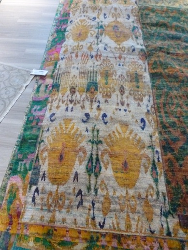
After a computer drawing of the pattern and colours was provided for me to sign off on, a sample was ordered so I could get an idea of what the rug would look like to confirm everything. Because I wasn’t sure if a true navy would be too dark and read as black, I requested one half of the sample we woven with a lighter blue to see what would work best. In the end I chose the darker navy, which looked more graphic and rich. Edie enjoyed testing out the sample herself (and even puked on it coincidentally)

master- rug making

After signing off on the sample, production began on the finished product. I was even sent a photo of the weavers at work! Seeing the artisans creating my rug was such a treat and definitely lets me appreciate the artistry under my feet every day.

(bedroom photos by stacey brandford)